Revising an existing design
The client
Eleyo CCA is a cloud-based program management tool for childcare providers, preschools, and enrichment programs. It was established in 2009 and is now connected to over 110 of the biggest school districts in the US. The platform offers a unified portal for the tracking of registration and participation of events, as well as managing invoicing, finances, reporting and other tasks. It streamlines operations, automates tasks, and provides real-time insights through analytics, enabling teams to better manage various aspects of their business.
The hope
Since Eleyo launched a new version in 2021, they discovered that the learning curve for the first time and less-tech savvy user has been perceived as quite steep. They brought on my team and I in order to conduct research and offer solutions so users could more confidently utilize the app while keeping track of kids.
project overview
My role
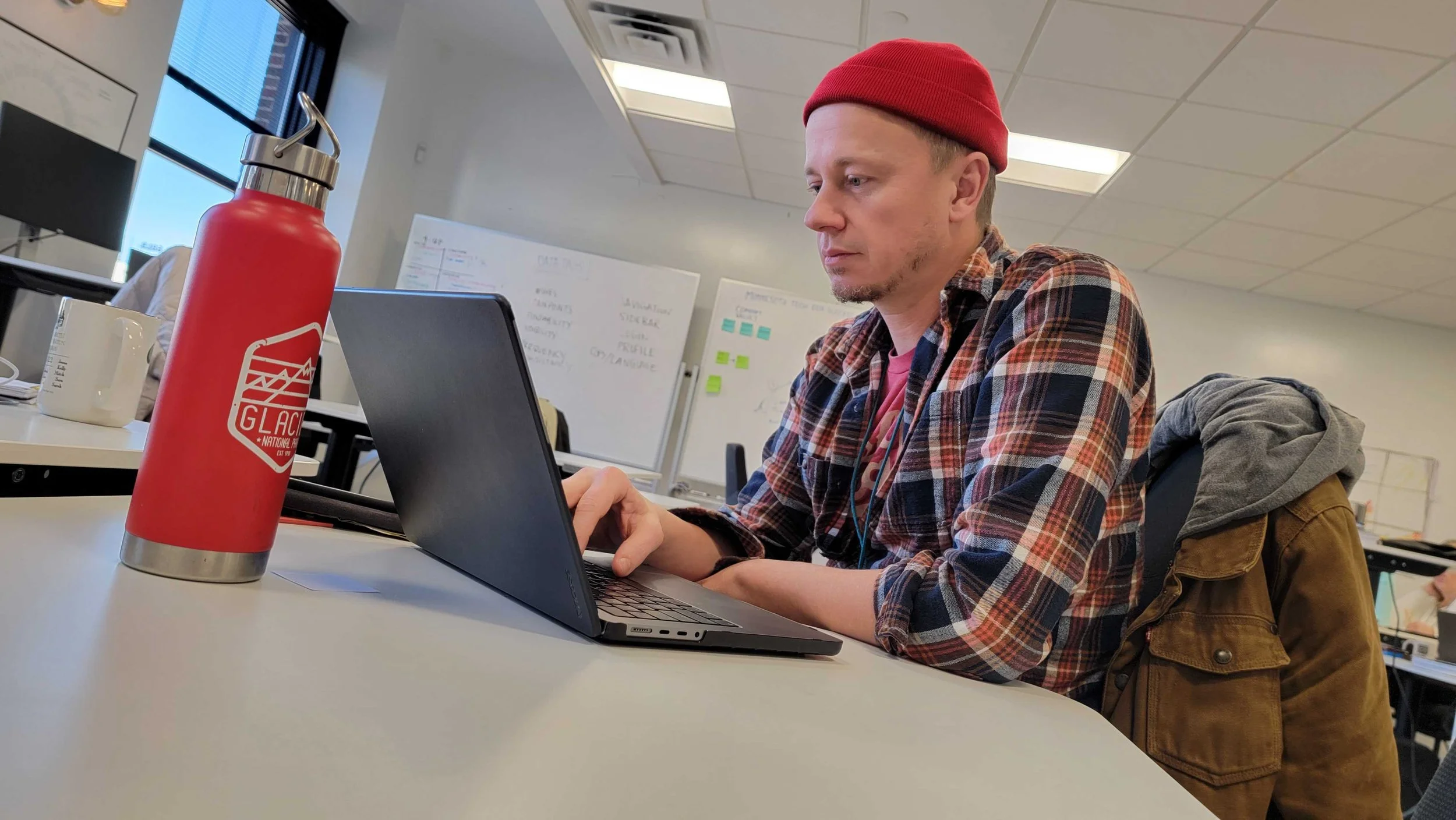
I had the opportunity to work with the Eleyo App for the span of a week where I discovered and highlighted the usability of their website and interviewed users to see how exactly they utilize the App in a professional setting.
I Conducted a Cognitive Walkthrough, Co-created a Primary User Research Protocol, Observed and recorded the remote Primary User Research testing sessions.
From there I helped find meaningful insights from the collected data and then created a working prototype based on my findings to offer solutions.
PARTICIPANTS
We had access to The participants that were provided were current users of the Eleyo app. Although the experience level and usage level varied greatly, this provided a vast view of how different users reacted to the app.
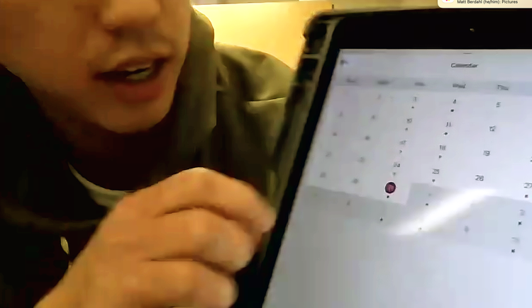
For one of our sessions, the participant spent most of their time attempting to charge their ipad. We were not able to have them walk us through how they use the app like we had planned, however, through directed conversation, and eventually showing them our ipad via zoom, we were still able to gain some valuable insights.
research process
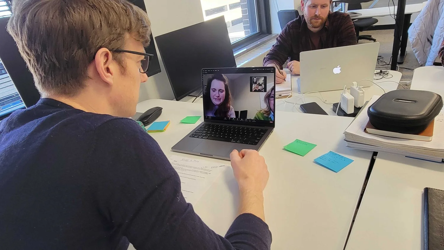
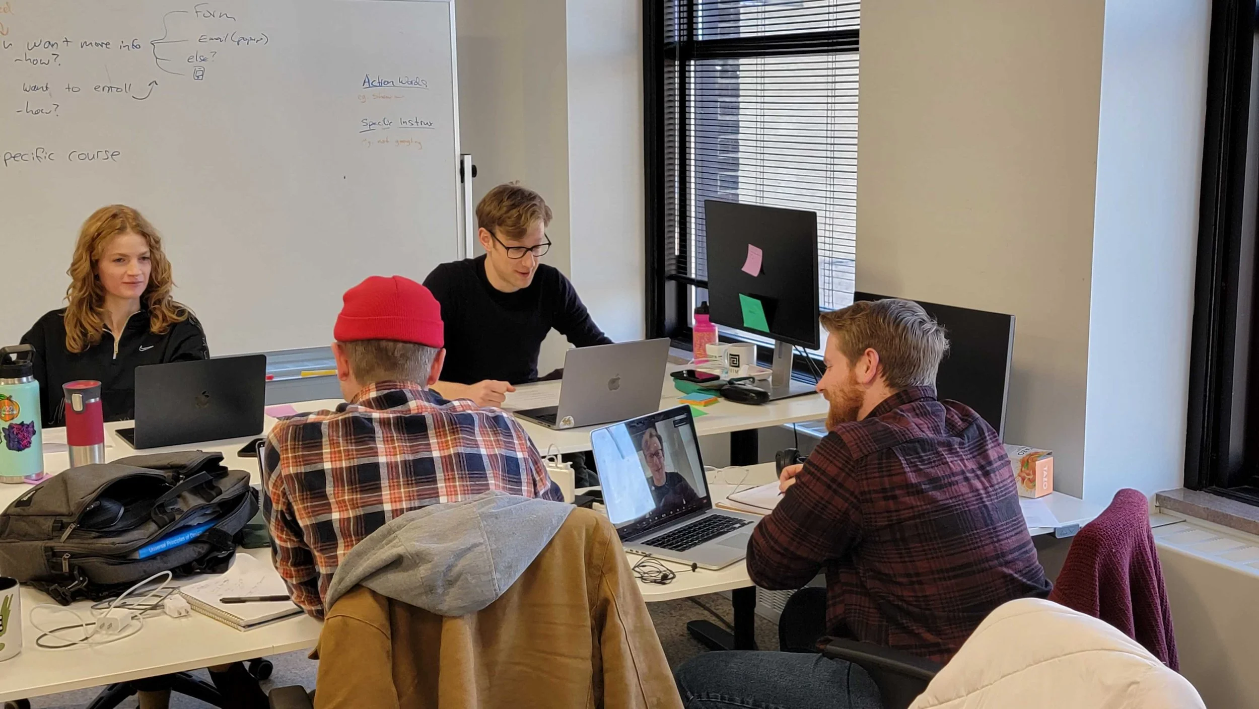
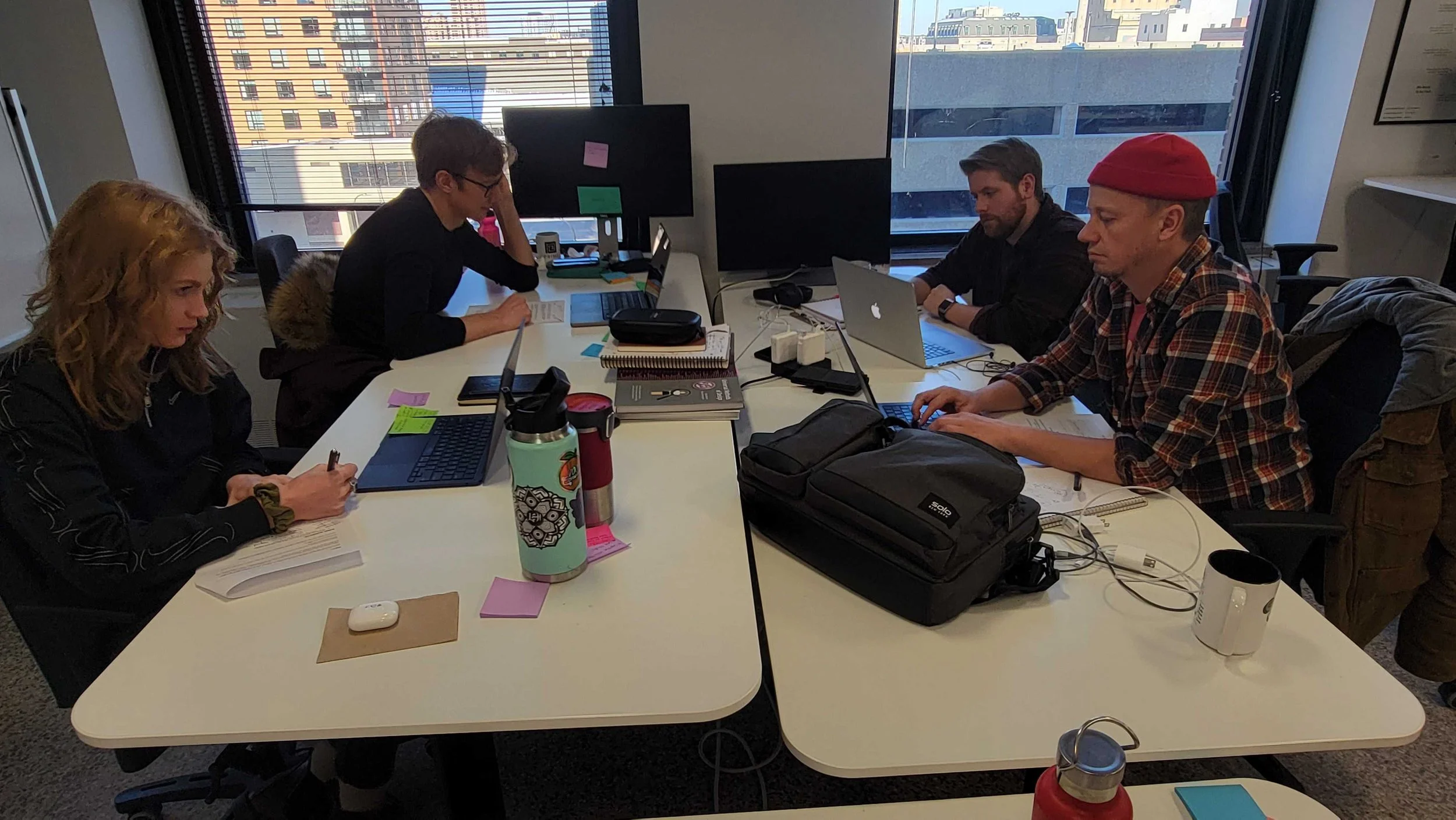
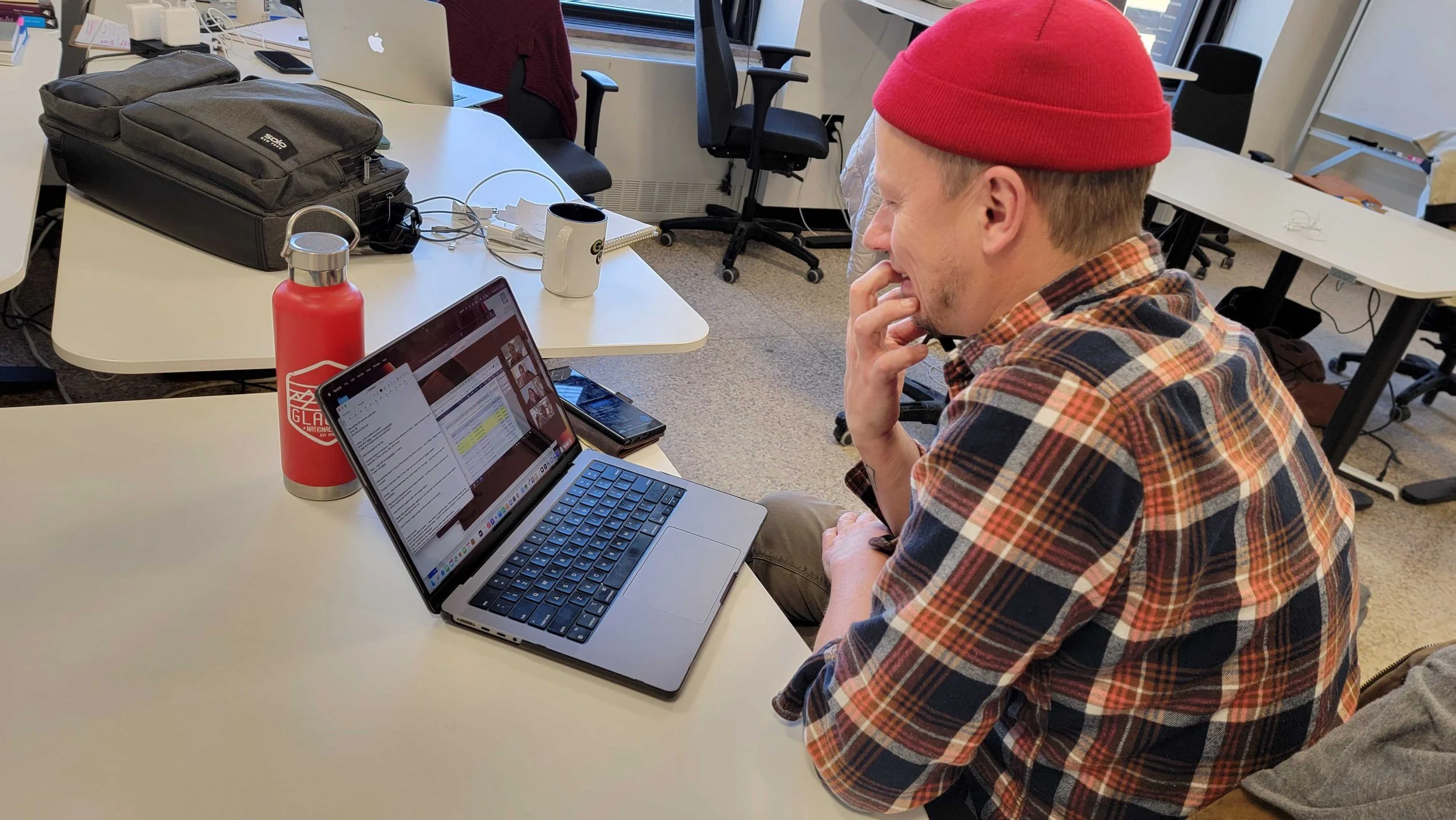
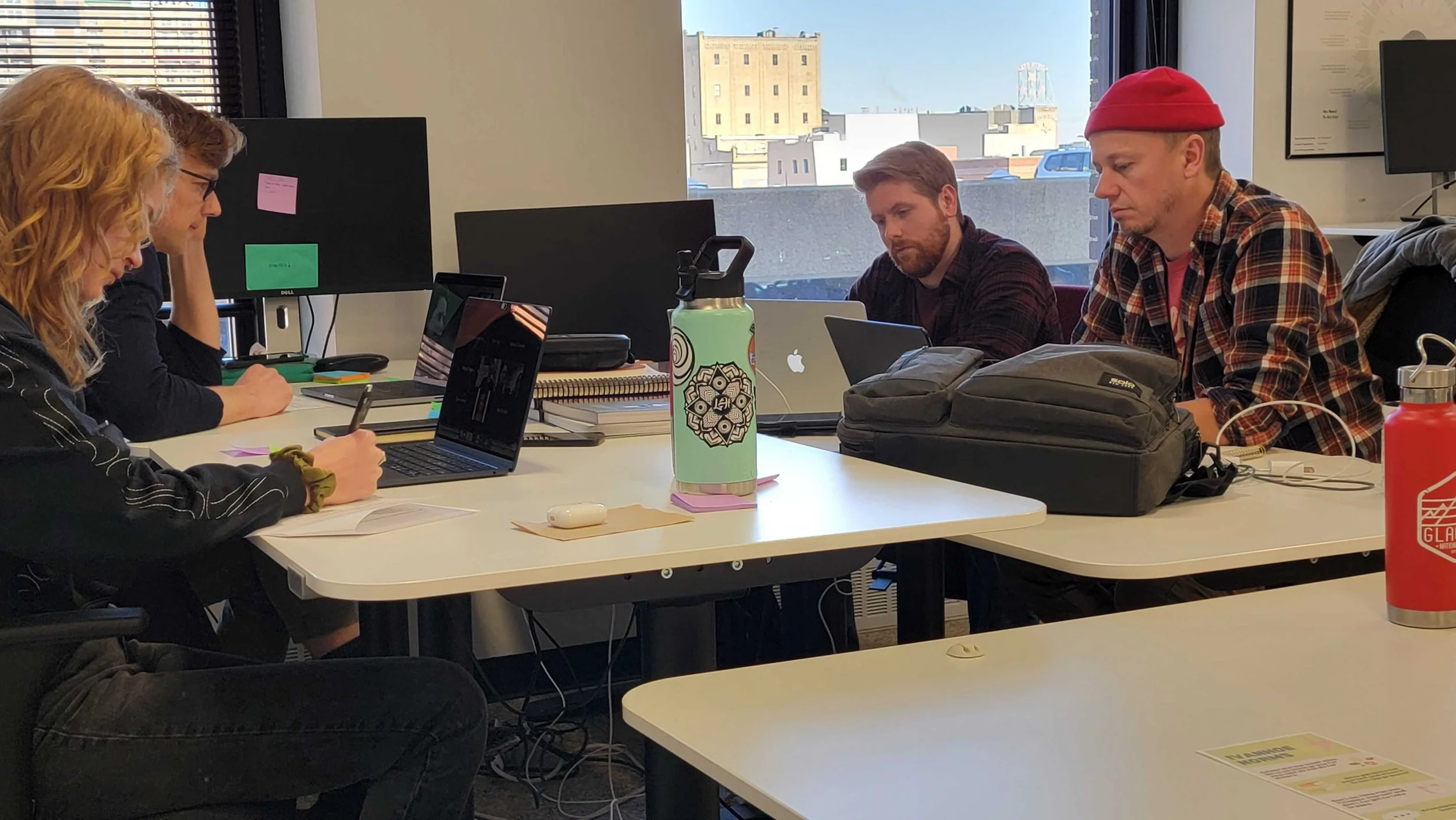
We worked in groups as well as individually when performing our tests and synthesizing data. This provided a wealth of knowledge to be collected. We then utilized Figma to compile and synthesize our research findings. Zoom was an indispensable tool to procure data from our participants remotely. We were able to record the sessions as well as witness the participants actions as they performed the tasks we gave them.
techniques
At the start of the research the plan was that each of us on the team would conduct a Cognitive Walkthru to begin to understand what the app did and what it provided. This was the beginning of the process to find better ways to meet the clients goals.
From there the team created a Primary User Research Protocol so that my team and I could perform a remote contextual inquiry. During the inquiry, my team and I observed the participants actively navigating the site as they would in a normal day to demonstrate how they perform a few key tasks. We would also actively partake in conversation and ask specific questions throughoutl
Once the research was done, my team and I synthesized the data into key findings and from there started a plan to create an interactive prototype.
Cognitive Walkthrough
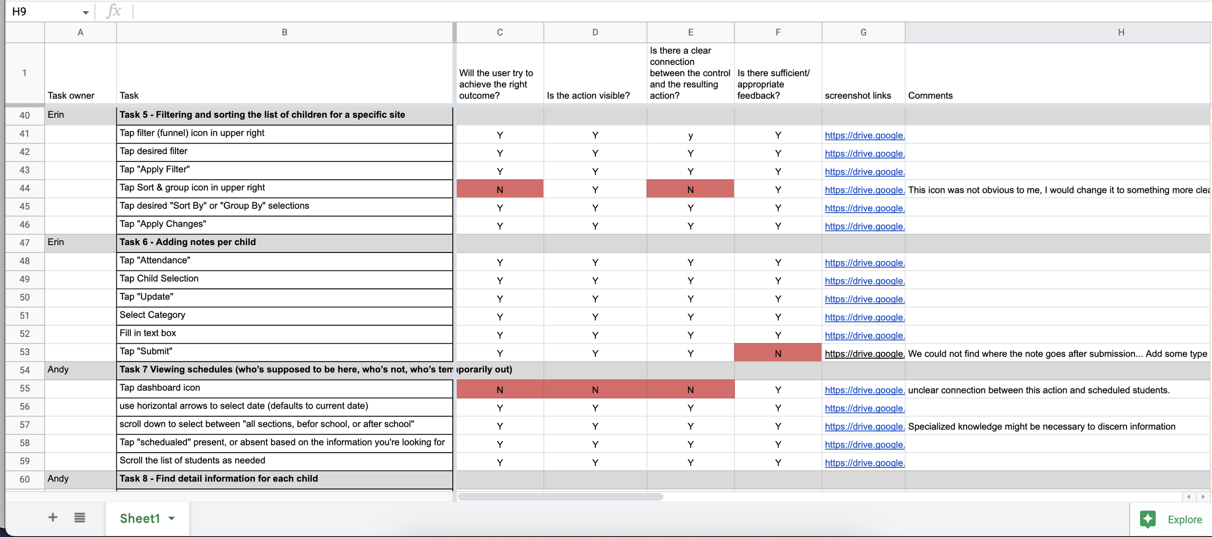
We initiated our study by conducting an online cognitive walkthrough, during which we gained a firsthand experience of using the application and examined the client's documentation to identify potential problematic functions for first-time users. Although the application had a conventional iOS layout and design, some of the icons and text were not easily associated with the client's intended functionality, resulting in challenges in connecting with users' mental models. We identified these areas as subjects for further investigation, and some of them emerged as significant problem areas.
The cognitive walkthrough gave me an insight into where there was likely going to be an issue. It was apparent to me that a variety of the icons were unclear with their intended functions. Beyond that feedback was minimal - in particular when signing children in and out.
tools
Apple MacBook Pro - Case Study Computer
Notion - Tracking Projects & Sharing Documents
Figjam - Data repository for sharing findings and collaberation
Keynote - Creating slides for findings and recommendation report
Slack - Communication and Meeting with Research Team
Zoom - Meeting with Participants and Recording Sessions
Contextual Inquiry
Our team held a contextual inquiry via Zoom to gain a better understanding of how the CCA app is used.
Through this inquiry I discovered the following:
1. No one really used the search function - even though that would be the quickest way to sign in.
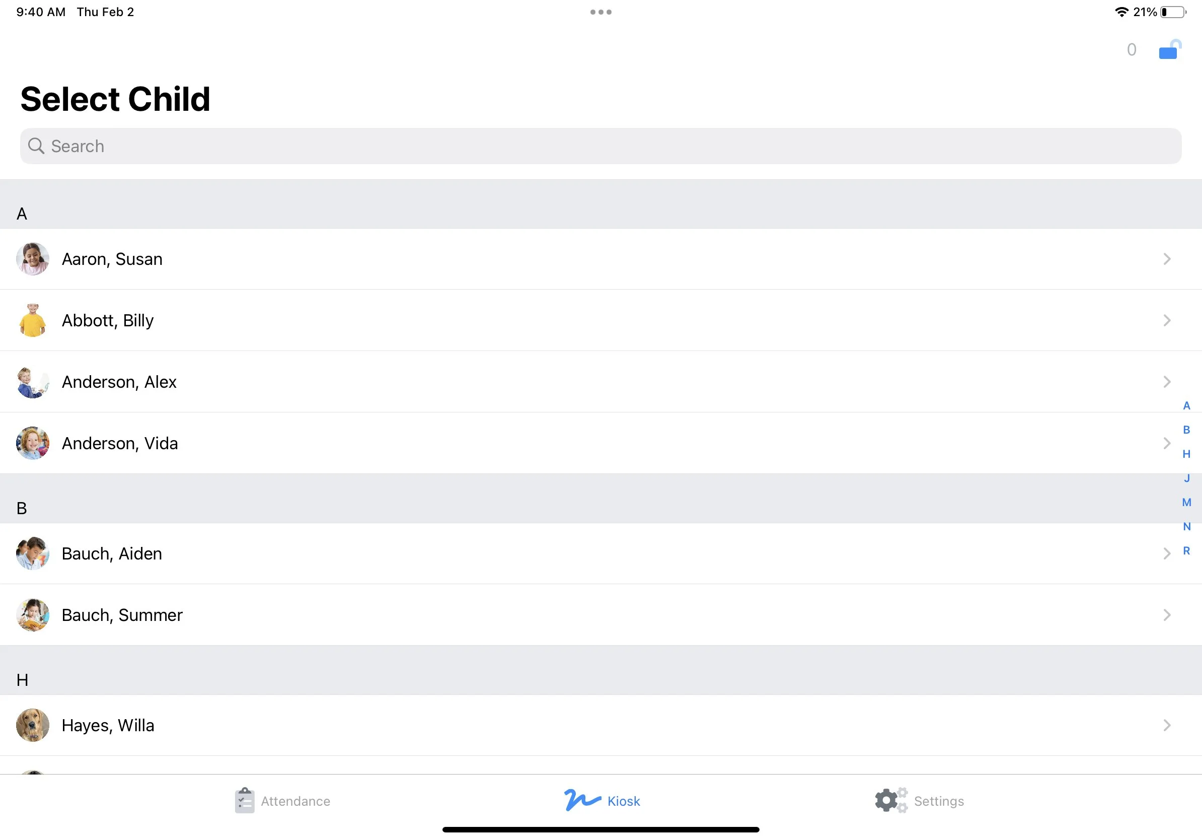
2. Kiosk mode and staff mode transitions were clunky and it was hard to tell at a glance what mode it was in.
3. Users often didn’t realize that the system hadn’t synched.
Because of these findings I knew that the visibility of the search bar and the kiosk mode needed to be amplified. These can be consolidated and in doing so also simplify the expperience.
User stories
Based on these discoveries, I formulated three User Stories to guide my design choices:
As a parent, I want to be able to efficiently sign my child in and out of the CCA app to avoid affecting our schedule.
As a care provider, I want to be able to switch between Kiosk mode and staff mode on the CCA app quickly and smoothly, enabling me to save time and focus on child care.
As a care provider, I want to be able to identify the current mode of the CCA app quickly, ensuring the privacy and security of student information.
Interactive prototype
Considering the user stories and research findings, I devised a scenario to direct my prototyping endeavors:
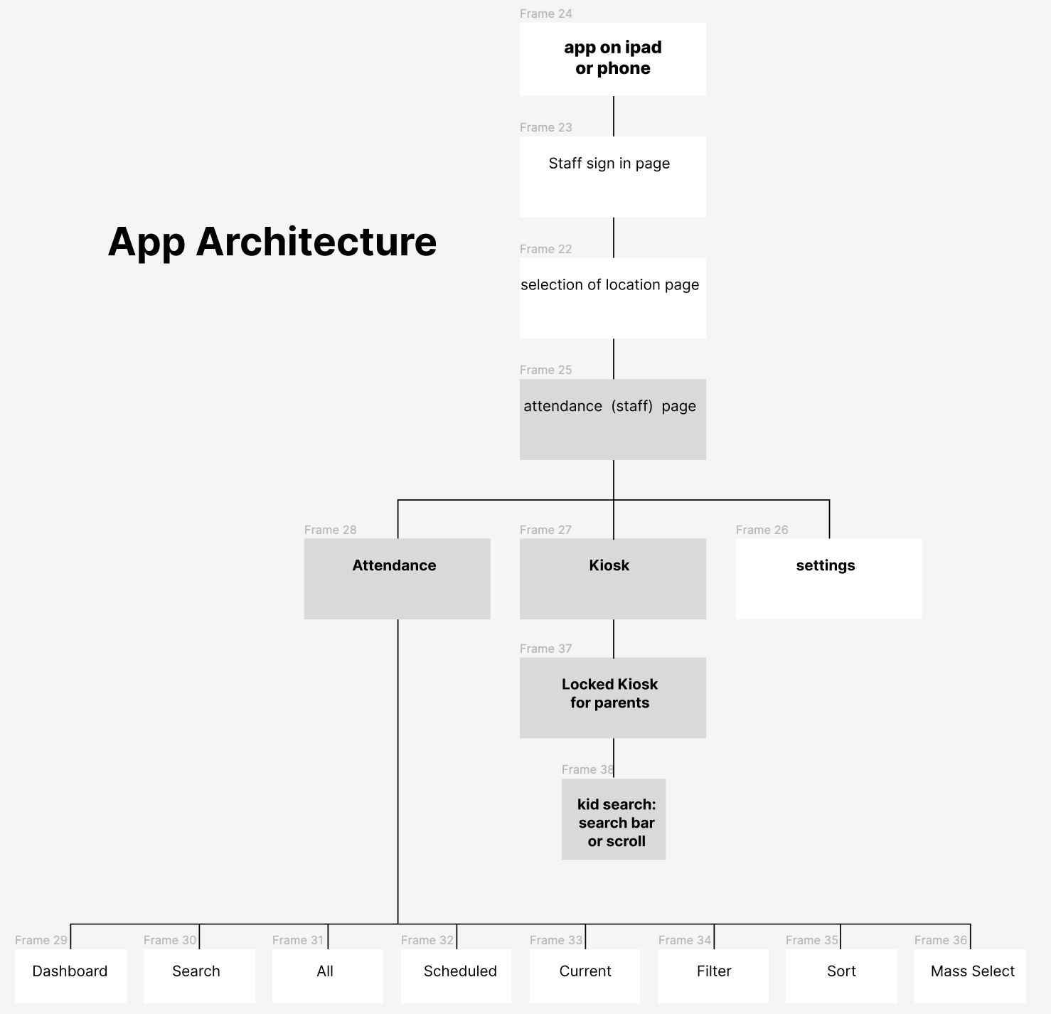
When staff members are transitioning from the parent-facing Kiosk mode back into staff mode, they can tap the unlock icon and input their access key. Once the access key is submitted, the app will direct them to the attendance screen, where staff members spend the majority of their time. By directly taking them to the attendance screen, the step of switching to the attendance screen from the "Unlocked" Kiosk mode screen can be eliminated, as staff have limited use for this screen.
Our participant's feedback, which revealed their dissatisfaction with the current illogical flow for staff members, was the driving force behind this alteration in the CCA app's flow.
In the end, I developed and incorporated the following changes:
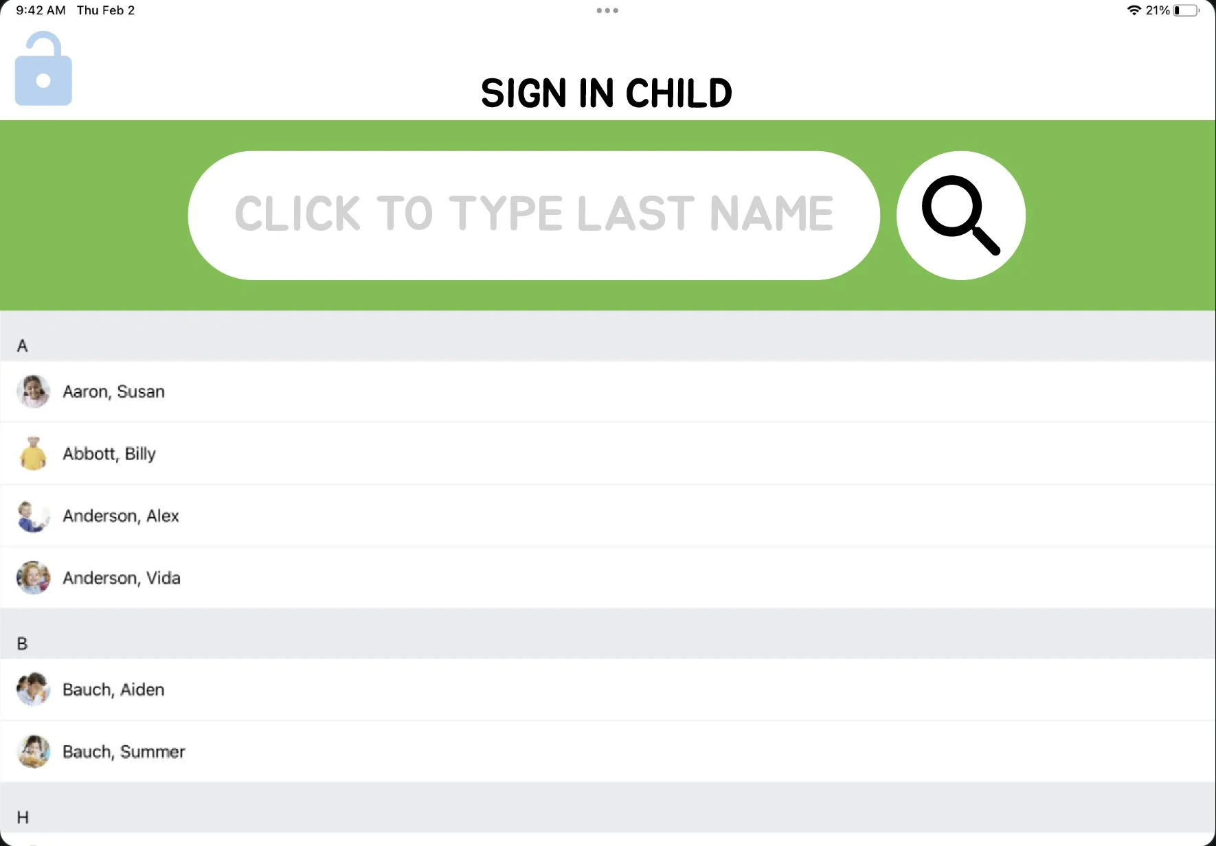
Enlarged and made the search bar green so that the parent/caregiver might utilize more.
The green search bar also served as a notice to staff that it is in a secure kiosk mode.
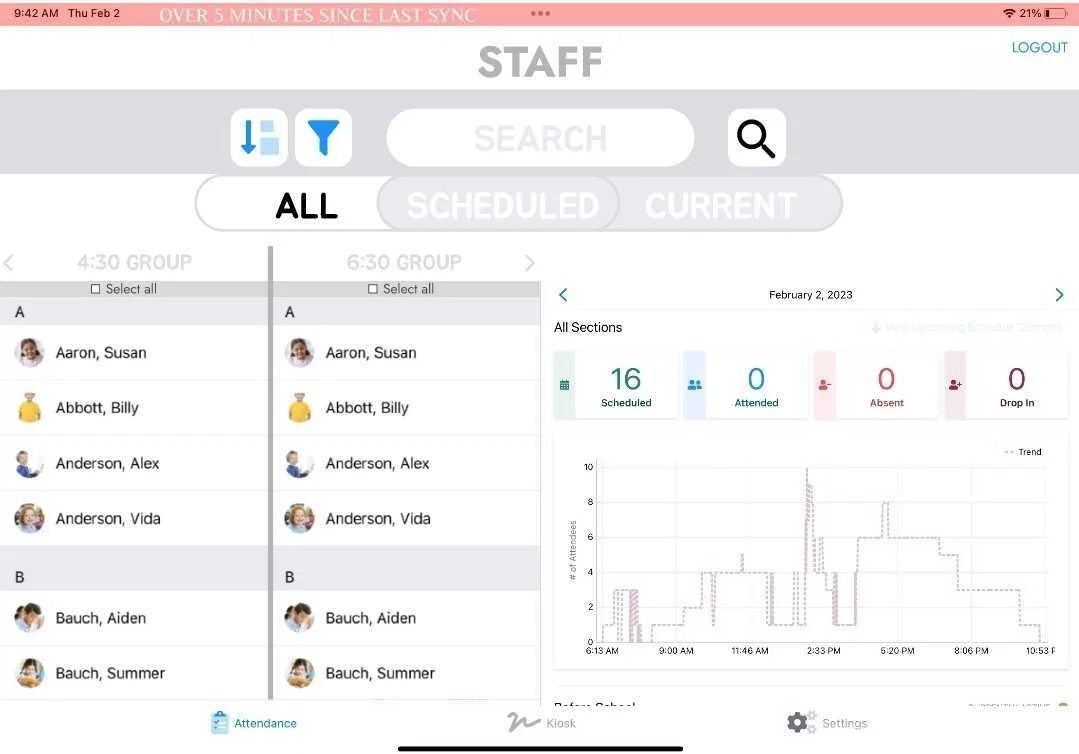
Implemented space for staff to see and scroll through multiple groups coming within the same day.
Added a notification bar to alert staff of synching issues.
View a video of the prototype in action above
Try out the prototype above!
Summary
Implementing the following recommended changes will improve the user experience for both parent and staff groups and increase overall satisfaction with Eleyo's CCA app.
Revise the screen flow of the CCA app to enhance the user experience and enable staff members to concentrate on their main responsibility (i.e., taking care of children).
Consider altering the appearance of Kiosk mode to distinguish it from Staff mode, decreasing the likelihood of confusion and privacy concerns.
Enhance the search function in Kiosk mode to make it more prominent, reducing the time parents spend searching for their child's name, shortening the child pick-up lines, and creating a more efficient experience for both parents and staff members.
Implement a function that signifies when synching has not occurred in a while and allow the user to manually synch.
