Food delivery website taskflow
project overview
Discovered concepts and areas of opportunity that users are lacking within the online food delivery and pickup space
My role
Over the last 2-week period I conducted discovery research through directed story telling to help me understand the experiences of current users of online food delivery and pickup services. From there I synthesized the information collected highlighting specific areas of opportunity, and then designed a prototype by creating wireframes and focusing on a specific task flow. The end of my time with the project was spent on prototype testing.
Directed story telling
I used directed story telling to gain access to the minds of the intended users. I wanted to know what they have enjoyed as well as disliked about past online ordering experiences and also any potential improvements and additions to their experience they would like to see in the future.
Through directed story telling I learned that my research group was mainly looking for quick, straightforward, and consistent ways to order their food with good deals, variety and personal touches so that they can feel valued as customers and not have their time wasted.
process
I created a loose script that began with the same statement.
“tell me about an experience you had with a website offering food for delivery or pickup”
Once the conversation started I had at the ready a variety of questions to accompany the organic conversation that happened.
during each interview I recorded the audio so that I could focus on the conversation and not have to divert my attention in order to write notes.
REsearch
Creating prototype
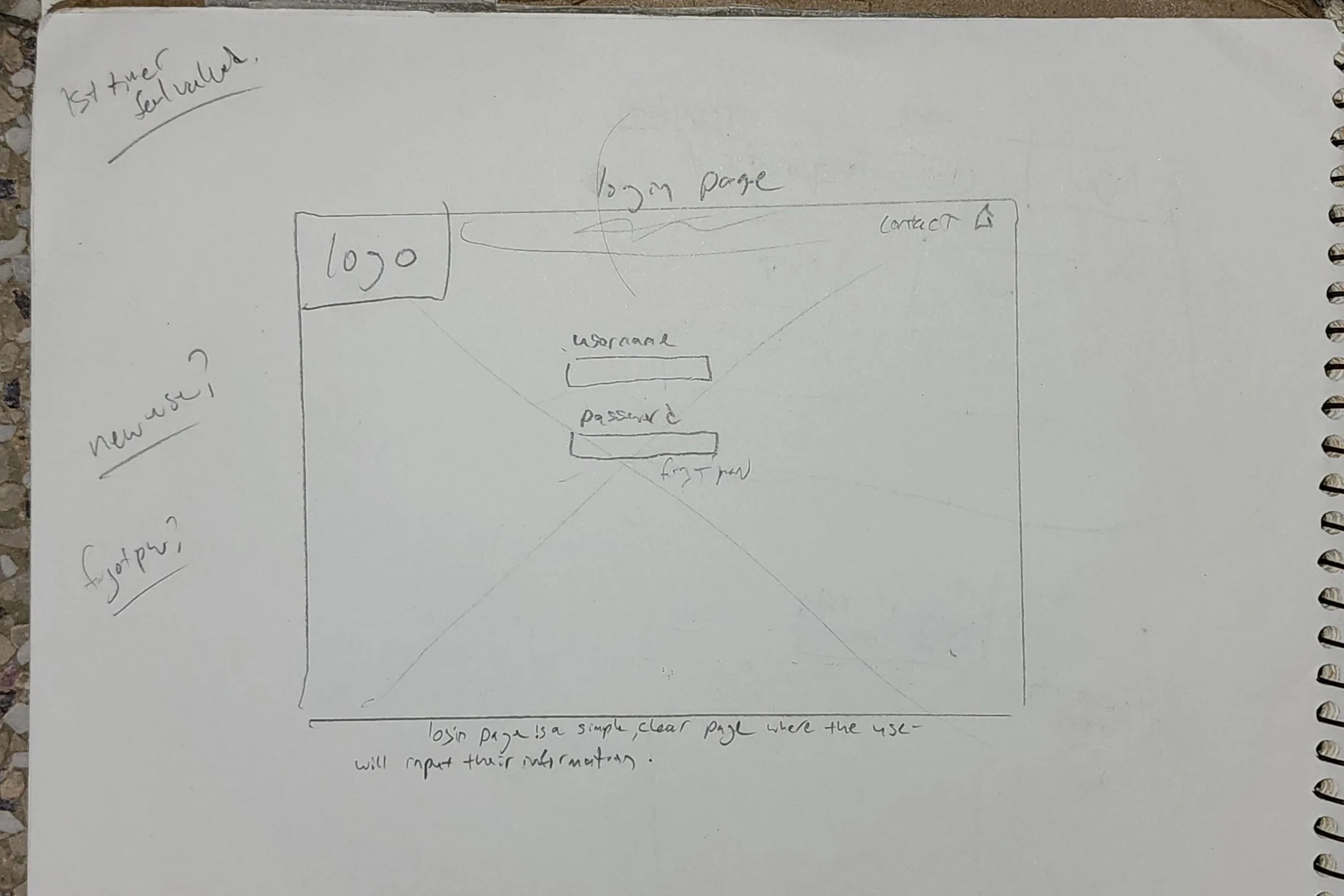
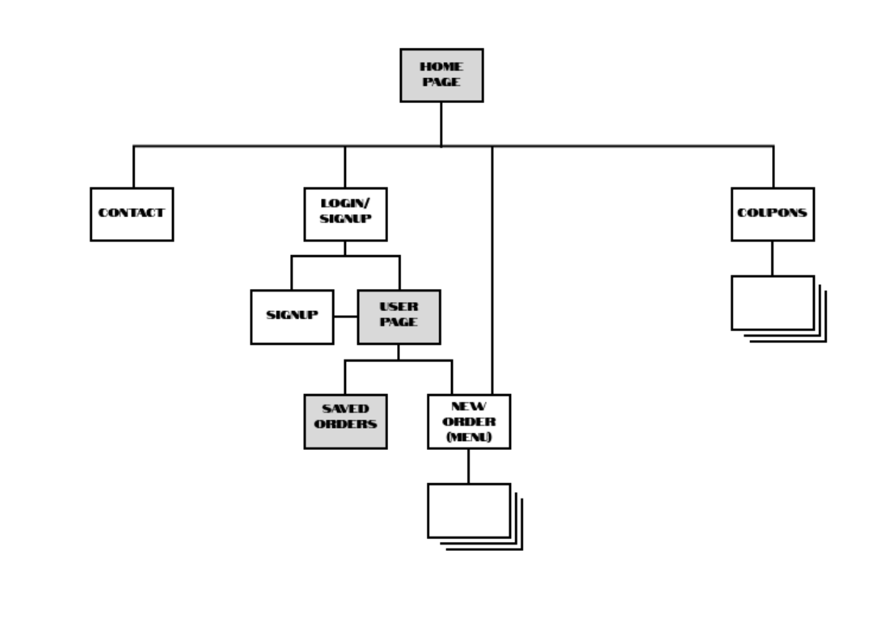
Based on the research findings, I created a website prototype. I began by sketching pages with pen and paper to organize a specific task flow. After a clear idea and path of that task flow was decided on I then created wireframes of those sketches in figma and eventually ended on a functional prototype that presented solutions for some of the pain points discovered in the research. It offered the users a more personalized experience as well as a streamlined way from the homepage to access their saved orders. I chose to present a specific style of restaurant to give my participants a more inviting, comfortable and familiar setting while testing.
Key pages tested
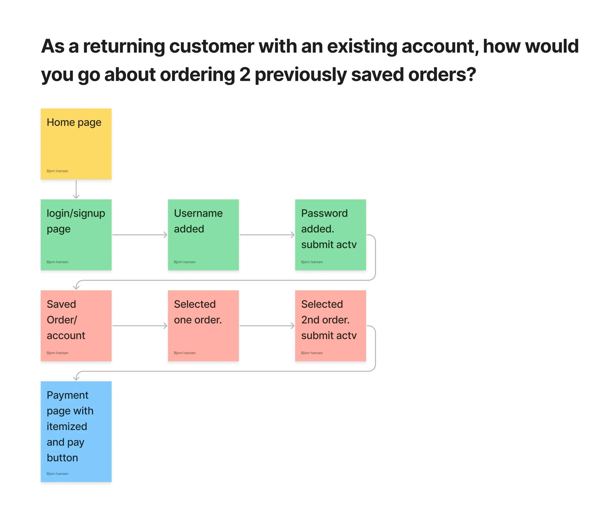
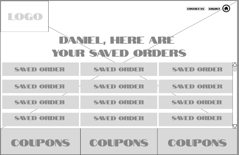
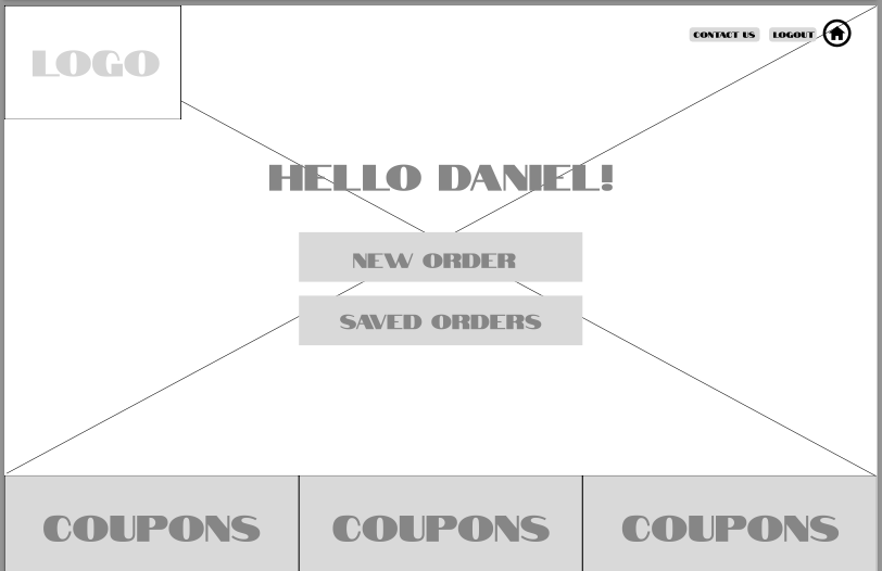
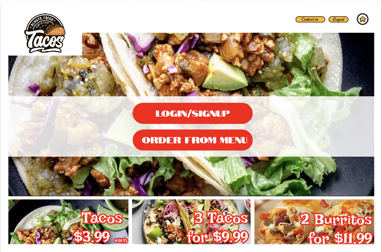
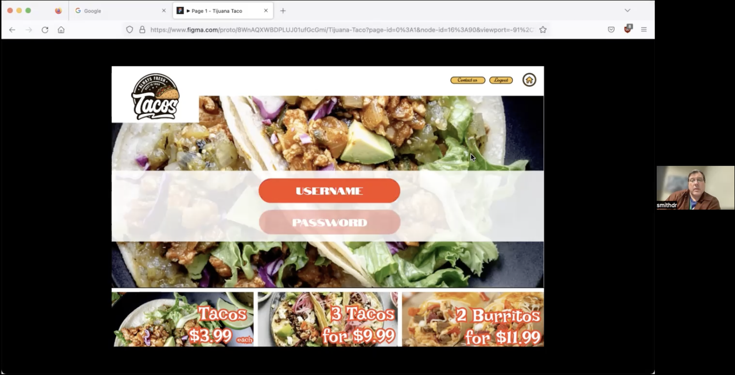
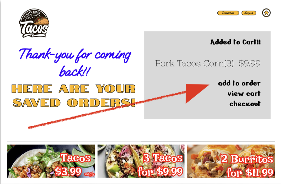
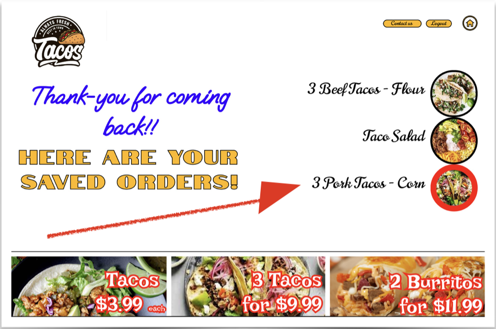
The task-flow for a simple and quick order that I wanted to test started on the simplified home page, continued through the personalized login page, and finished just past the quickly acquired saved order page.
Testing the prototype
Utilizing the think aloud technique I evaluated the prototype with a new group to test the solutions. I pulled from a sample of four participants which were chosen at random.
The zoom calls were recorded, with permission, to be able to accurately recall data as well as be able to examine and be available to guide back on track if the participant went off course. Each participant was given the same scenario just prior to them gaining access to the site.
“You are a frequent user of a Mexican restaurant and their website. You just got home from a busy day and have plans early in the evening. In order to expedite the daunting task of eating you want to quickly access your account with the restaurant and get any one of the dishes that you have saved”
Impressions and findings
Users were able to navigate the prototype with minimal issues, but there are areas of improvement that will afford an even more streamlined and straightforward experience.
Utilize and maintain consistent visual signifiers throughout the site.
Remove some unnecessary elements that were discovered during the think-aloud prototype testing.
Although all four participants were able to navigate through the given user-flow, there were some points given that need attention.
confused by where/how to input their user information and password.
tempted to click ‘new order’ because it was above ‘saved orders’.
when attempting to select a saved order they expected to be able to click on the text.
‘logout’ button on the initial page which made them feel like they were already signed in.
“I really wanted to click on the text that says ‘three pork tacos’ to order it. It won’t let me!”
“Oh hey! It’s me! That’s awesome that they already know it’s me!”
“…why can’t all websites be this straightforward”
Ultimately the findings of this project will provide a more pleasurable experience for the customer and also provide a more robust customer base for the potential client.
next steps
moving forward there is potential to solve the problems found during prototype testing as well as continue research on how else to elevate the customers experience. I would like to see more development with the concept of coupons that the customer can see throughout this task-flow and others as they navigate the site.
