Usability of the Mtfs website
The problem
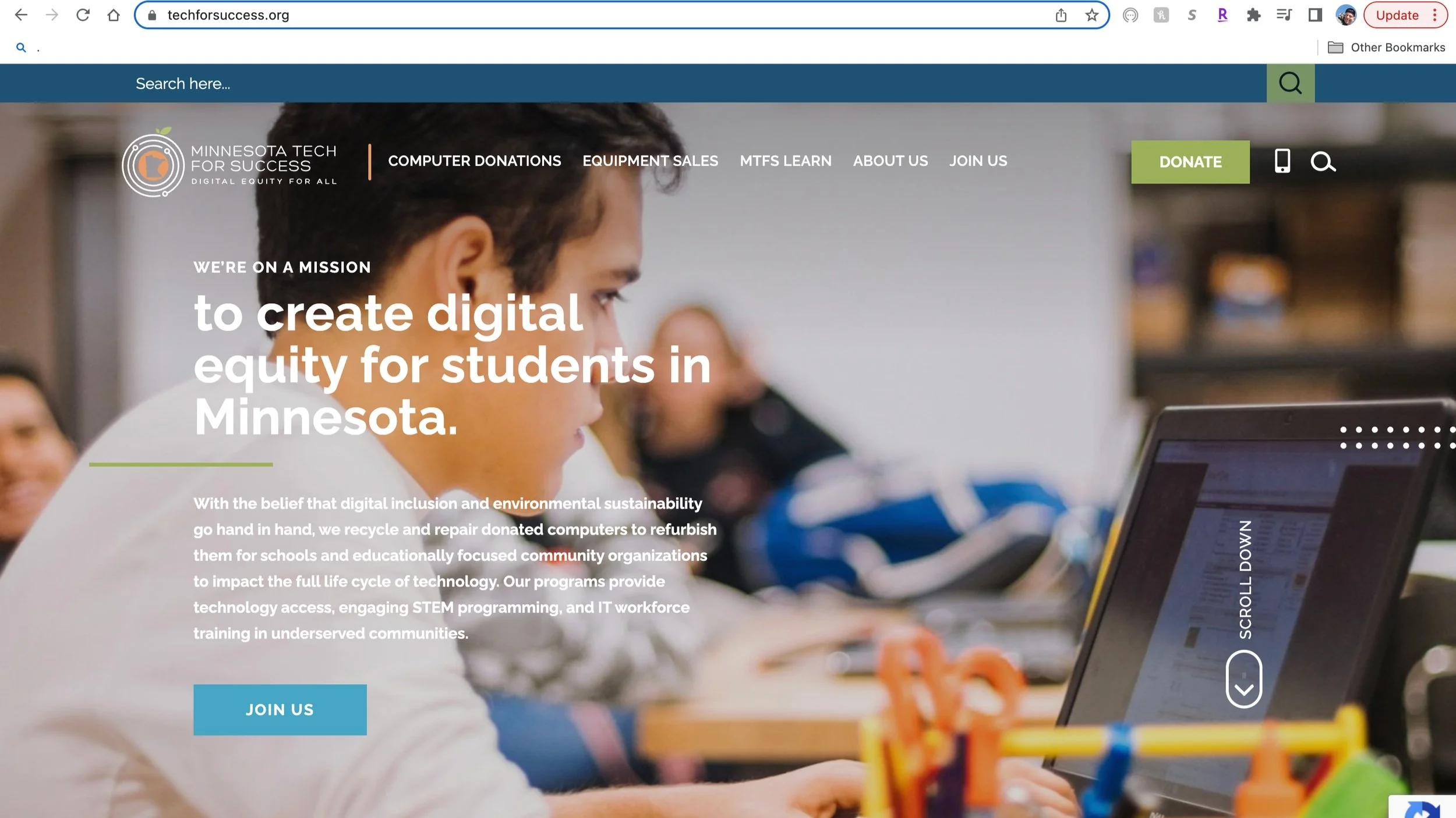
Minnesota Tech for Success (MTFS) wants to provide students of all ages the skills and confidence they need to succeed in school and begin a successful career in information technology. To accomplish this prospective students and career counselors should be able to easily and quickly acquire course information as well as have a low-friction step toward engaging with the recruitment team.
The Solution
Evaluating the usability of the site and running usability tests with participants gave the team a glimpse of some opportunities for improvement.
We recommend improving the users experience on the website by reducing interruptions and providing clear feedback of actions, and making information easier to find by using accessible terminology and providing convenient support.
project overview
My role
As a member of a Prime Digital Academy UX research team, I had the opportunity to work with the MTFS website for the span of seven days. I was brought on, as were the other members of my team, to discover and highlight the usability of their website in regards to specific key tasks of finding information on courses, course content, and the ability to reach out for more information.
My role in this process involved multiple steps:
Conducting heuristic analysis on the website
Developing a script for a usability test
Moderating remote usability testing sessions with numerous participants
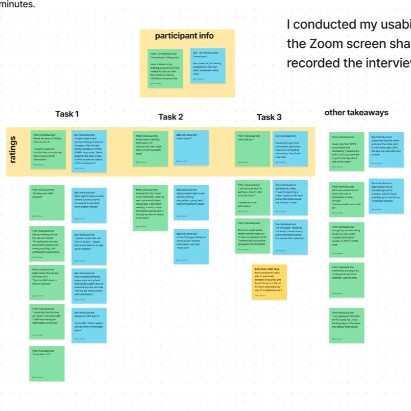
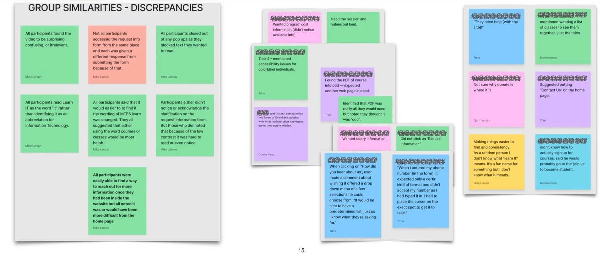
Analyzing data and synthesizing the findings to identify trends and patterns
Creating a Findings and Recommendations report to present to the client
Throughout this process, I worked collaboratively with other team members to gather information, identify issues, and make recommendations for improving the website's usability. My role was critical in ensuring that the research was conducted efficiently and effectively, and in providing valuable insights and recommendations to the client.
PARTICIPANTS
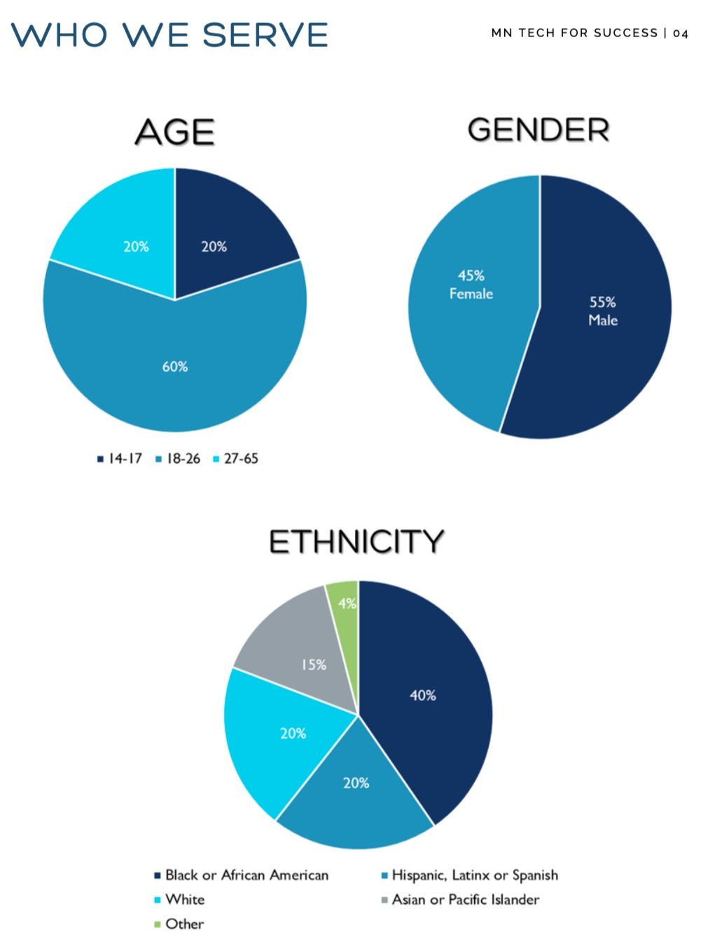
Participants for my individual research were recruited from a pool of potential users based on who MTFS serves. That information was found in the 2021 Minnesota Tech for Success Annual Report.
It is also important to note that the participants had history or current experience with job loss, career transition initiatives, and/or housing insecurity.
Participants for the group project were provided for us from a selection of volunteers.
These volunteers were told our group was hoping to conduct research with participants who identify with one of the following:
Experienced unemployment or underemployment
Sought learning opportunities in tech to later pursue internships, employment, or further education
Experienced any barrier to employment (prejudices, stigmas, cost of entry, lack of access, etc)
However, anyone who was willing to participate was welcome, regardless of the degree to which they identified with any of those categories.
research process
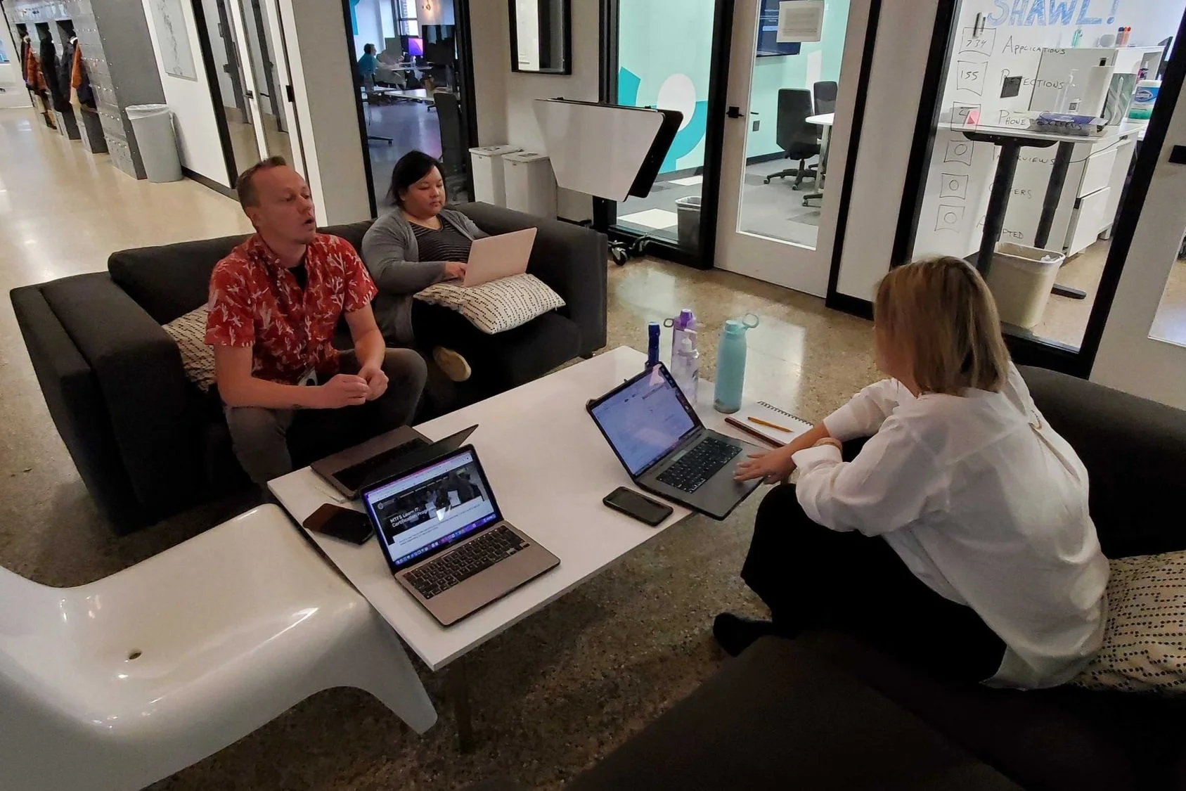
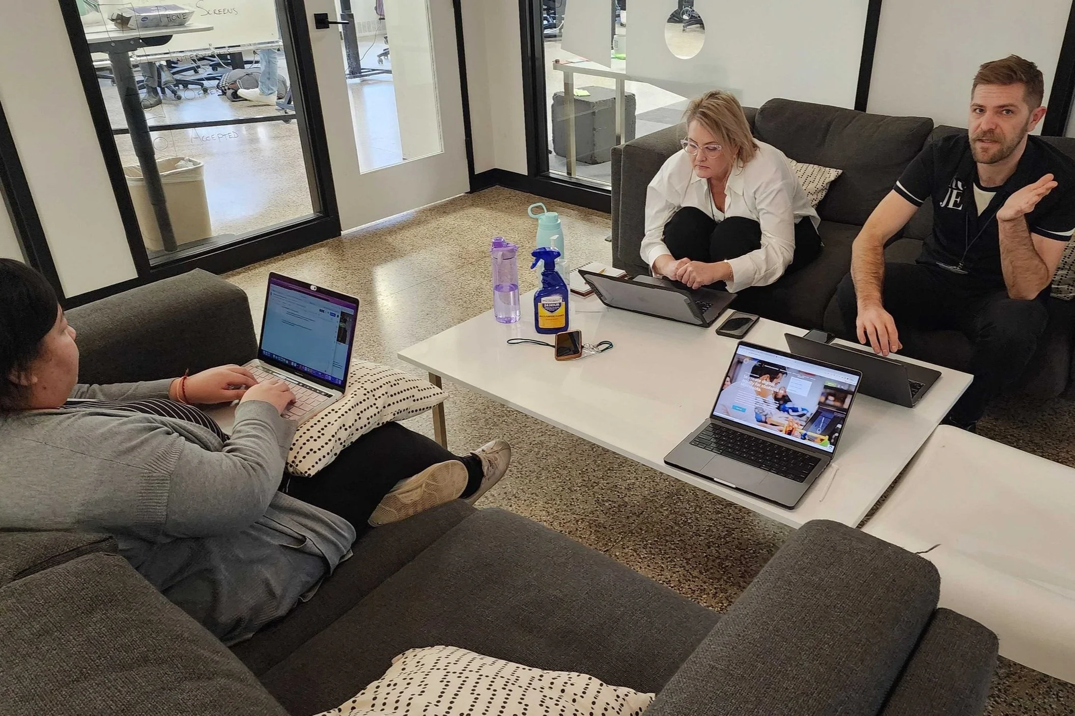
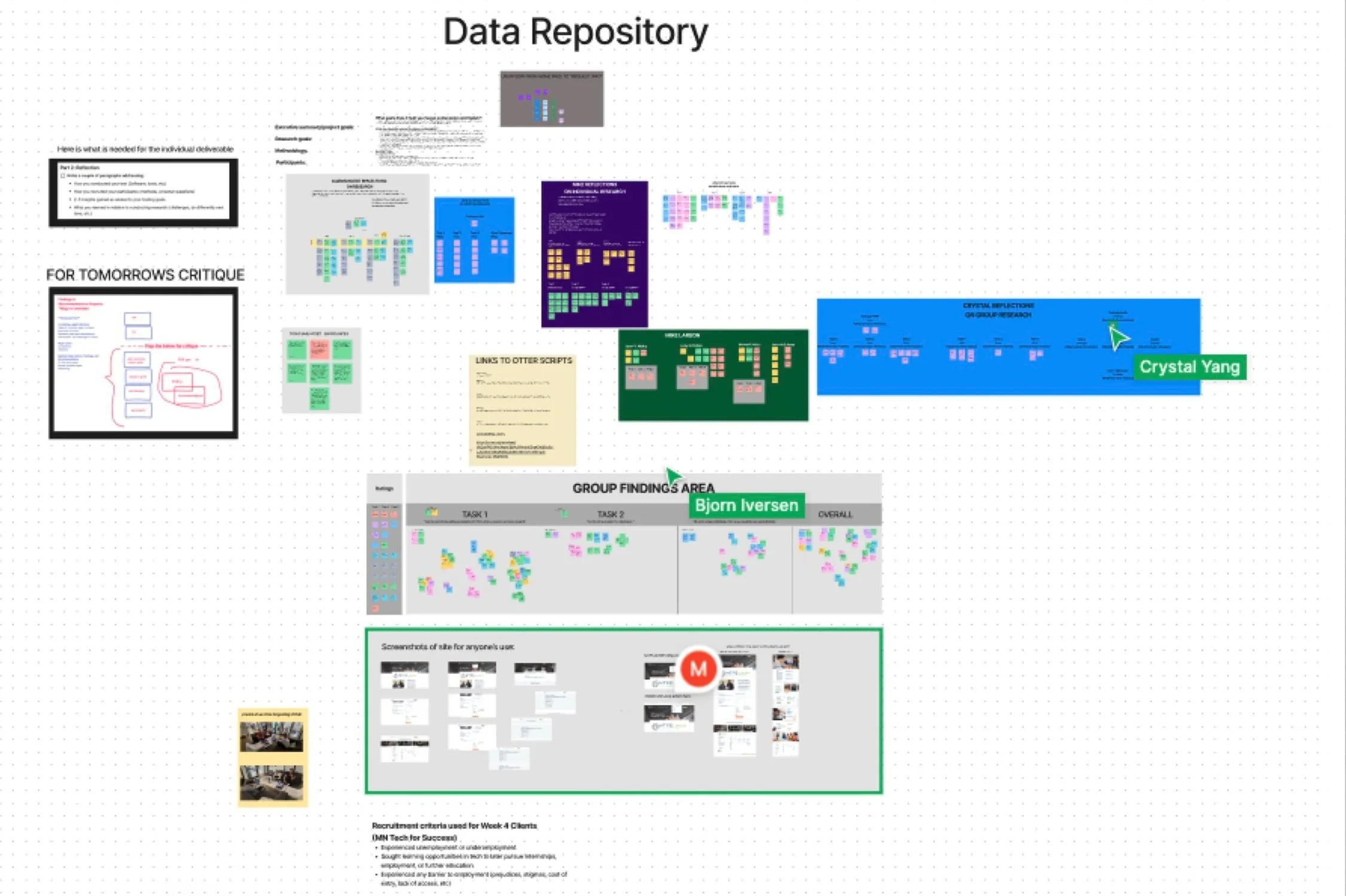
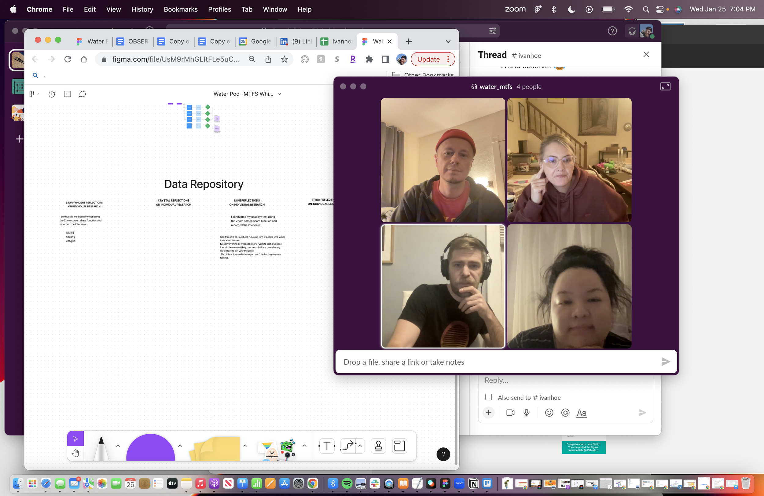
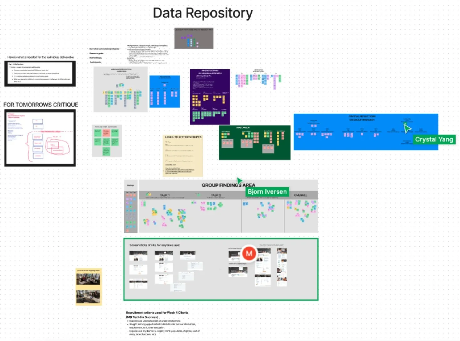
We worked in groups as well as individually when performing our tests and synthesizing data. This provided a wealth of knowledge to be collected. We then utilized Figma to compile and synthesize our research findings. Zoom was an indispensable tool to procure data from our participants remotely. We were able to record the sessions as well as witness the participants actions as they performed the tasks we gave them.
techniques
At the start of the research the plan was that each of us on the team would conduct a heuristic analysis to begin to understand the usability of the site and start the process of finding better ways to meet the clients goals.
From there the team created a usability test which would involve multiple participants actively navigating the site to perform a few key tasks while utilizing the think-aloud method.
Once the test was made my team and I conducted the test individually as well as a group, testing a total of 11 participants. With the information collected we then synthesized the raw data to further see how users interacted with the site.
With the findings grouped by similarities and common themes we could then begin to create a report that would show some of the main findings and offer recommendations for improvement.
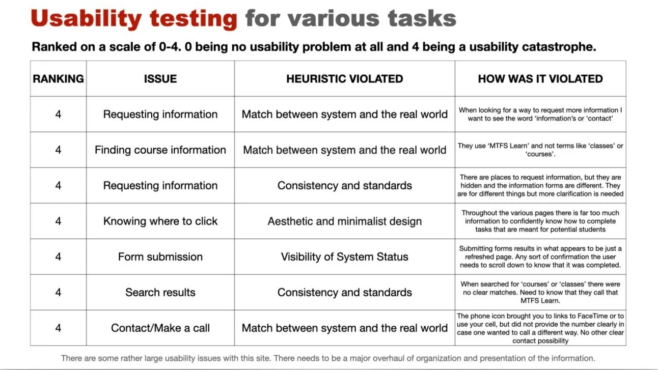
While analyzing the website I was probably a bit harsh on the rankings, but each of the issues found were, to me, catastrophic to the tasks at hand. Each task attempted I failed to complete and would have continued on in frustration to another site to find information on courses in technology.
Heuristic analysis
Through my analysis it was discovered that there were numerous heuristic violations happening throughout the site.
I remained focused on completing key tasks on the website and made note of the violations I found during the process. I identified that there were numerous issues with the site's usability and suggest that a thorough cleansing and reorganization of the information presented is necessary. Additionally, I recommended that the team focus on improving the website's adherence to usability heuristics, such as consistency and standards, and aesthetic and minimalist design, in order to address the problems throughout the site.
The findings and recommendations will likely play a significant role in shaping the future design of the website and improving the overall user experience. By focusing on the key tasks and usability issues, valuable insights will come about that will help guide future design decisions and ensure that the website is more user-friendly and accessible.
tools
Apple MacBook Pro - Case Study Computer
Notion - Tracking Projects & Sharing Documents
Figjam - Data repository for sharing findings and collaberation
Keynote - Creating slides for findings and recommendation report
Slack - Communication and Meeting with Research Team
Zoom - Meeting with Participants and Recording Sessions
It was now time to create a script…
Creating script
In order to conduct a usability test, we needed to create a script for testing. The script was based off of a Usability test Plan that my team developed as a group that focused on the goals and questions we came up with based off of our clients input as well as the research we conducted. We included questions to ask each participant after each task as well as at the end of the session about the site as a whole.
We created two versions of the script. One for the Moderator and one for the Observers/Notetakers.
PERFORMING USABILITY TEST
With script in hand my team performed 5 usability tests with 5 different participants. Each of us took turns taking on the moderator, technician, and observer rolls.
I had something here…not sure what
synthesizing the data
With script in hand my team performed 5 usability tests with 5 different participants. Each of us took turns being a moderator, technician, and observer rolls.
client pitch presentation
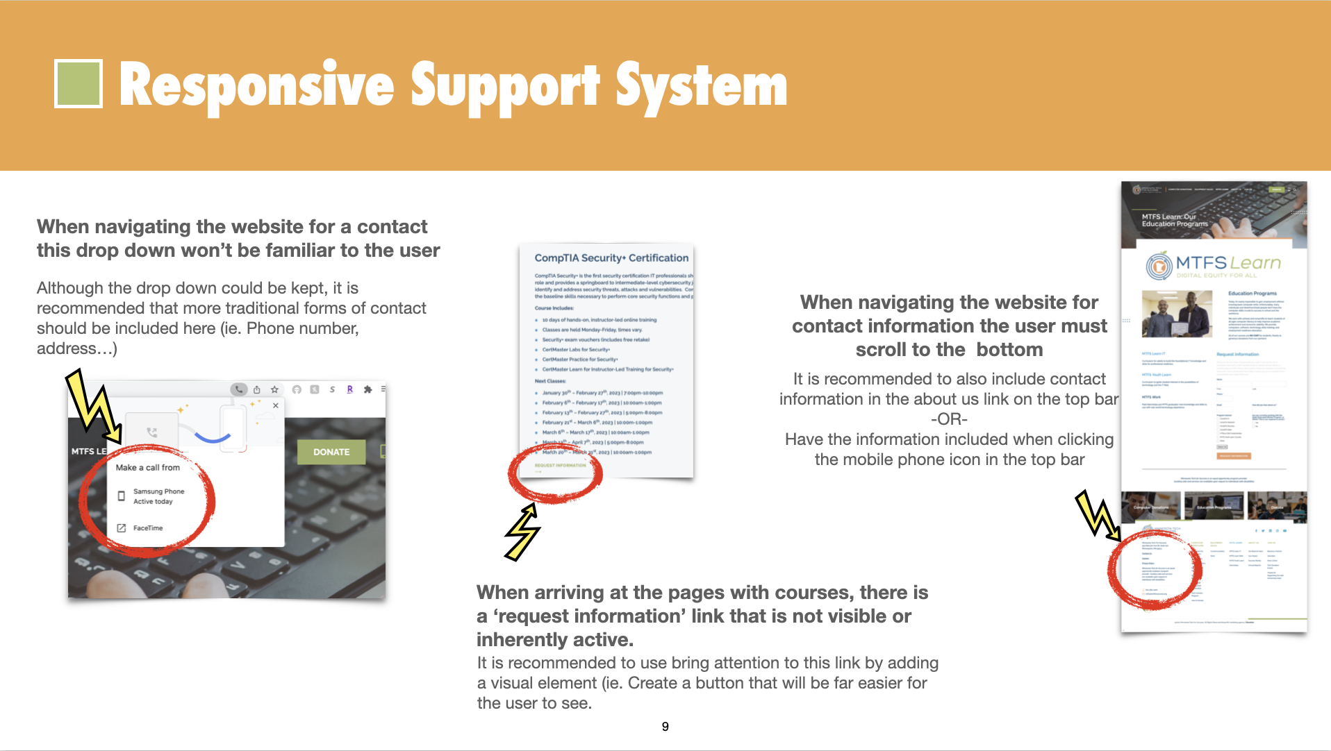
The following images are from the Findings and Recommendations Report that will be presented to the MTFS organization…
the findings from the research will continue to grow the site
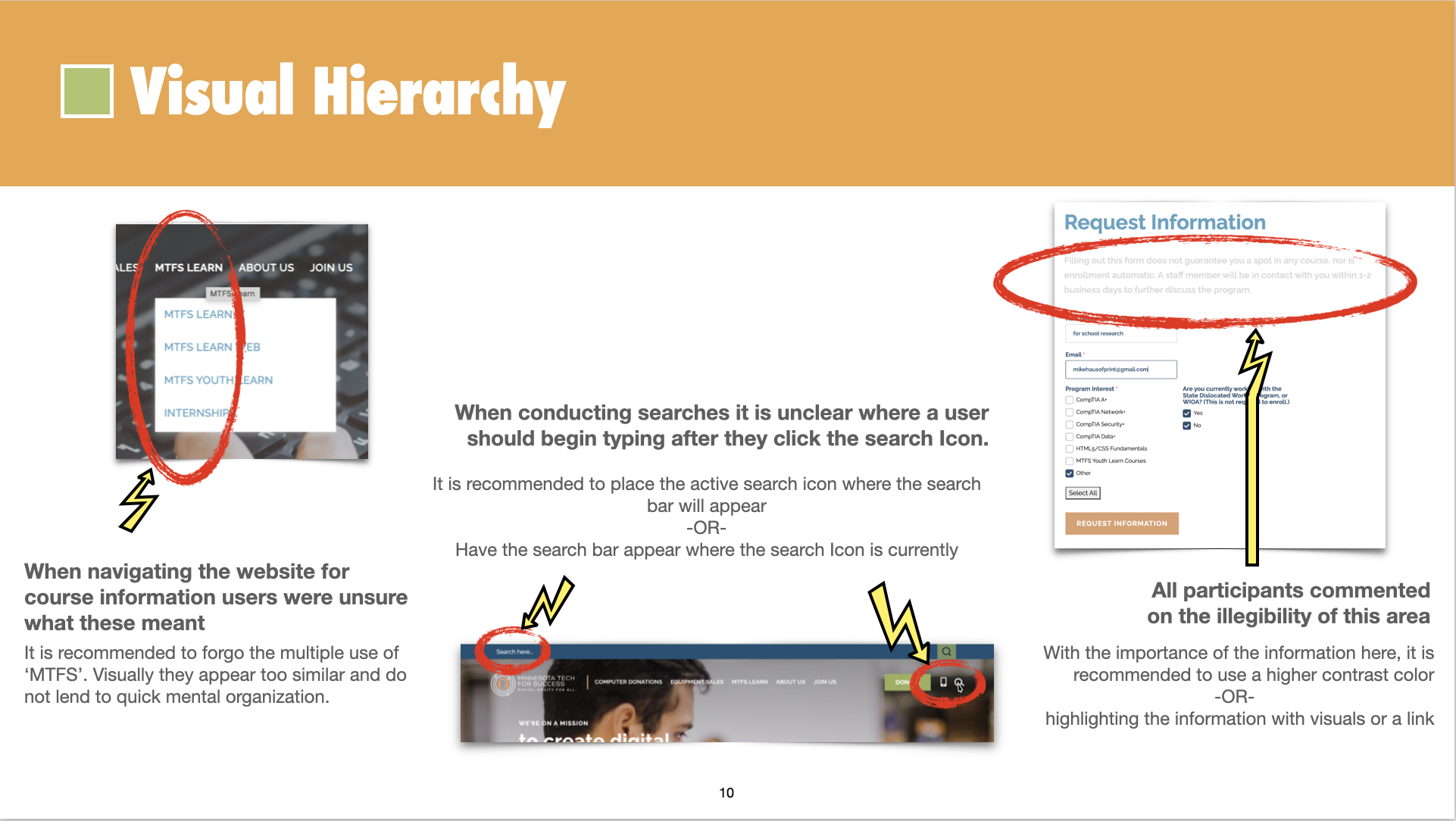
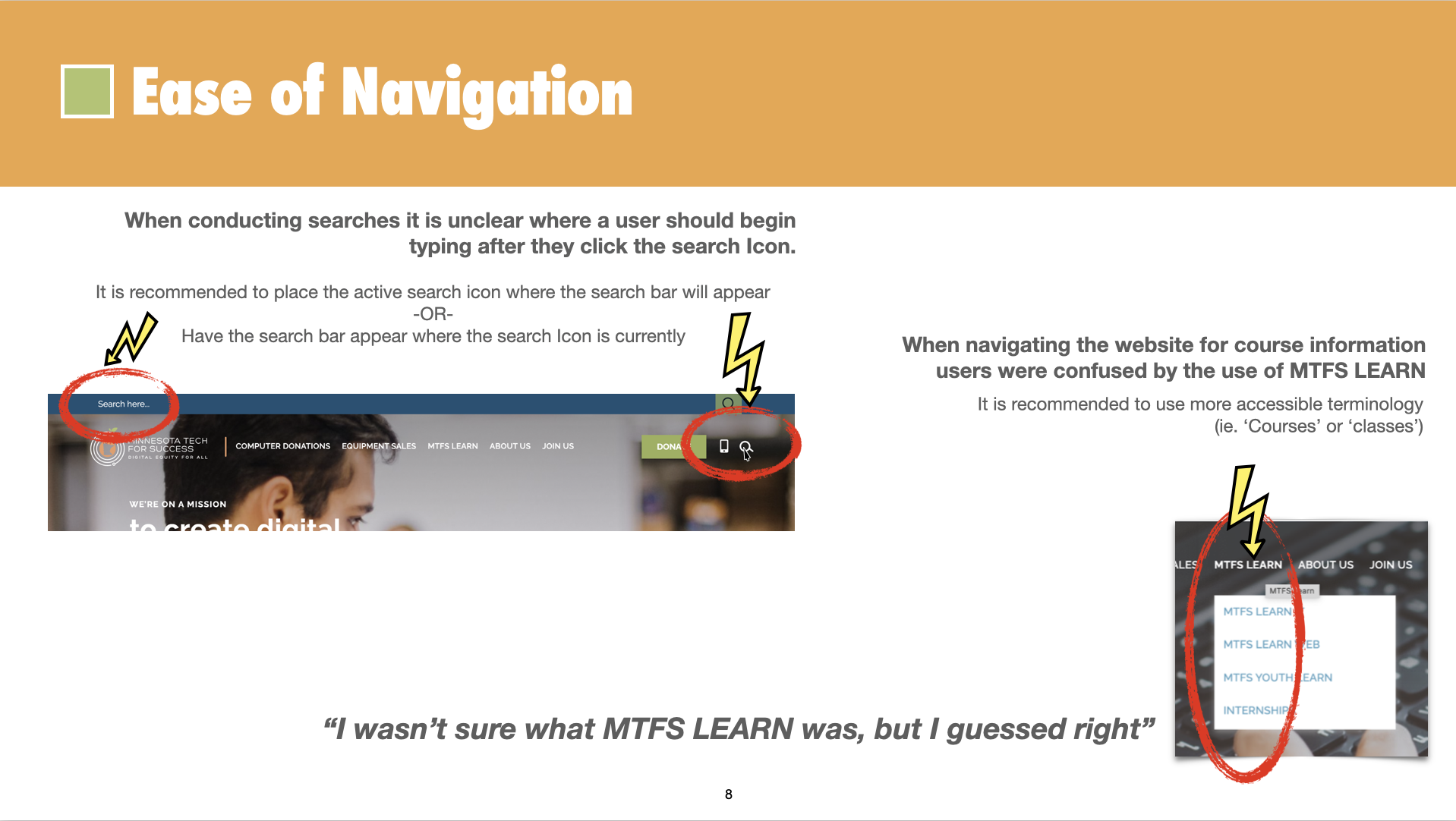
The MTFS website has some real potential. All of the participants liked the services they were offering and felt they could navigate fairly easily. There are definite areas of opportunity to streamline the visuals and methods of navigating to specific areas.
next steps
Have the application process itself available online.
Offer an evaluation/test/quiz that could help a prospective student determine what area of IT might be the best fit for them.
Inclusion Goal: Some of our users chimed in about being confused about who the classes were actually for (children/adults/etc)
This is an opportunity for future research sessions to ask something along the lines of “in what ways do you feel represented or under-represented as you viewed the site?
Next time we would test other aspects of the website but due to time constraints, limited our research scope to the main focus of the client goal which was the education portion of their public facing marketing page.
While users did see beauty and great potential with this website, it falls short of user expectations. Providing students of all ages the skills and confidence they need to succeed in school and begin a successful career in information technology begins when the future student navigates their website. To accomplish this prospective, students and career counselors should be able to easily and quickly acquire course information as well as have a low-friction step toward engaging with the recruitment team.
We recommend improving the users experience by reducing pop-ups throughout the site. The ‘In need of information’ pop-up and the unrelated video that appeared after the information form was filled both blocked important information.
When doing specific actions, like filling in the form and submitting, make sure the user get the feedback that lets them know what happened and what to expect.
Using accessible terminology, will provide a smoother experience for the user. When using branding jargon the meaning gets lost and in turn the user as well.
